
I have been a fan of the One Piece manga and anime for over 15 years and as a tribute to it, I decided to do an analysis on their most recent film, One Piece Film: Red. One Piece is a manga/anime that follows Monkey D. Luffy (A.K.A Strawhat Luffy) on his journey to finding the lost treasure of the King of the Pirates, the One Piece. From a design and marketing perspective, knowing the target audience having seen the film, I think the poster did a great job at pulling us in. The largest image in the poster is of Red Haired Shanks, who OP fans have been dying to see more of for years. The positioning of each of the elements suggests the conflict at hand and frame the subject, Uta, at the center of this conflict.
System/Grid
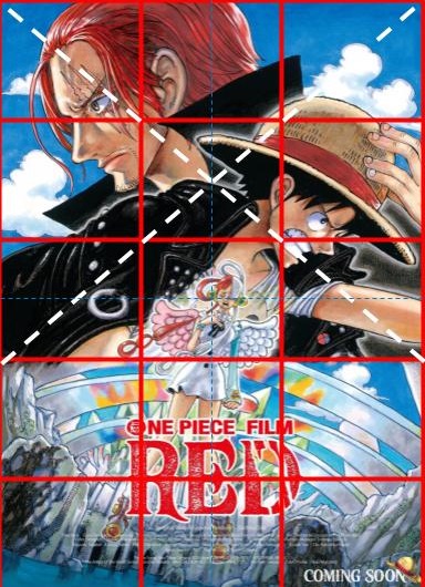
I divided the image into a 3×5 grid and noticed that there were elements that intersected with the grid and elements that existed within the spaces of the grid. I also added 2 white perpendicular diagonal dotted lines that traced the position of two of the main characters and 2 dotted blue lines that divided the poster into equal halves.
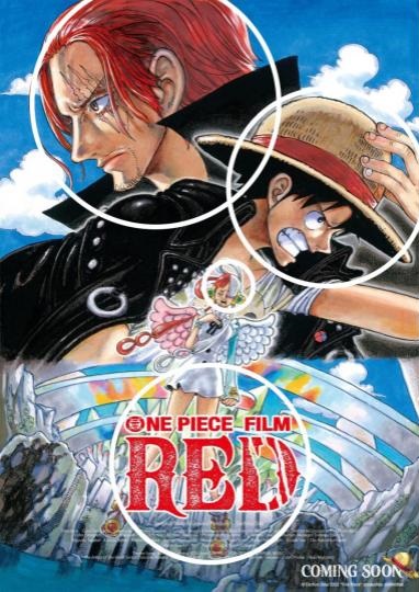
The poster features 3 main Characters: Red-Haired Shanks (top left), Strawhat Luffy (top right), and Uta (centered). We can see that the main division of the grid separates it into a vertical 3:2 ratio of character:setting.
On the top portion of the poster we see the 3 main characters each falling into the 3 vertical columns. It gives us the idea that the characters are the dominant features of this film and who we should be looking out for. The white dotted lines and the corresponding directions of Shanks and Luffy. It is important to note that out of the 3 characters, Uta is the only one whose face does not fall on an intersection of the of the 3×5 grid, however she does fall directly in the center intersection of the poster as highlighted by the blue dotted line. Shanks and Luffy’s opposing positions intersecting each other suggests conflict and Uta, existing in the clear space beneath them suggests that the conflict is over her.
On the bottom, we see the setting of the film as well as the title directly center of that portion of the poster. The title is intersected by all 3 lines in the poster denoting its relevance and putting it in a position that immediately catches the eye of the viewer.
Hierarchy
When looking at the image, Shanks and Luffy are the most obvious elements of the poster. It is important to note that Luffy is the main protagonist of One Piece and so it makes sense that he is in front of Shanks on the poster, however, Shanks’ image is the largest and is also placed above Luffy. This suggests that Shanks may play a more significant role in the film. What’s interesting about this choice is Shanks is one of the most important characters in the One Piece universe but has extremely minimal screen time in the series/manga. Knowing this, his appearance and dominance of the poster can be seen as a deliberate marketing choice to attract curious fans. His position across and behind Luffy (our protagonist) might also suggest that he is an antagonist.
Next, the word “RED” comes to focus and leads the eye up to the “ONE PIECE FILM” TEXT. It is because of the location, the boldness, and the striking color of the words that we notice it amongst the very colorful noise of the image.
Uta is the smallest element of this image however she is centered, indicating that whatever the source of conflict, it is centered around her. Uta might also be the smallest in the image because she is a new character who we knownothing about. From a marketing perspective, the irony is that although this film may be centered around Uta, she is least recognizable and so least likely to sell the film.
Typography
Using myfonts.com I was able to identify one of the two main fonts on the poster. The “ONE PIECE FILM” line uses what looks like a custom font resembling Sans Serif Bold Helvetica Neue font in bold and caps. Luffy’s Jolly Roger (A skull and crossbones with a straw hat) can be seen in the “O”.
For the “RED” and “COMING SOON” they used what looks like a custom serif font that has a 3-slash scar on the D to represent the scar on Shank’s left eye. The letters also have median spurs that resemble a Western font on a Wanted Poster. Wanted Posters are used in the main One Piece universe to denote characters’ relevance, strength and influence in the One Piece world. The middle arm of the “E” also has a spur that resembles an anchor, which is suitable for a story about pirates.
The smallest text detailing the credits was too small to identify in the online versions of the poster I could find, however I was able to see that they used a sans serif font. The font is also in white and barely visible, as this section of a poster usually is, which implies that it’s a less important piece of information from the context of the average viewer.
Color
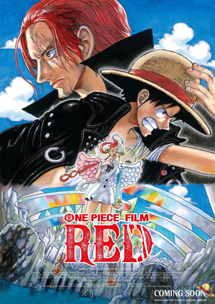
Although this is a fairly colorful poster, 4 main colors stood out. Red, blue, black and white.
The choice of “RED” as a movie name is to represent “Red Haired” Shanks. That red can also be seen in the band on Luffy’s straw hat (originally given to him by Shanks), in one half of Uta’s hair (assumably inherited from Shanks) and the wings of her costume and in the title of the film which obviously corresponds with the name of the film. The color red usually represents danger and blood. We might see blood as meaning family, one of the major themes of the film, Uta being Shanks’ adopted daughter and the red on the strawhat symbolizing Shanks, also, symbolically adopting Luffy when he gave it to him in his origin story. We can also see it as blood/danger denoting what’s expected from this film.
The blue represents the sky and the sea, which are expected elements in a series about pirates.
Black and white are two opposing forces; yin and yang, good versus evil. Luffy might be our protagonist, but he is still a pirate, as is Shanks. Uta’s white wings, white outfit and white hair could symbolize her being pure of heart, or angelic and thus suggest that the fight might not be between Luffy and Shanks, but Luffy and Shanks against Uta. The red in her hair, however, should not be ignored. As we have previously established, red can mean danger and this might be a sign that Uta is not as pure as she seems.
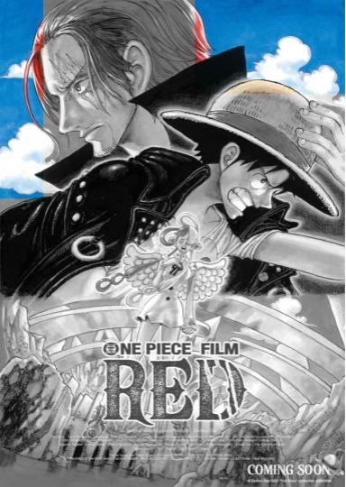
The Poster doesn’t have much negative space at all. Even the sky, which could’ve been left blue plain blue, has been given some more depth with the inclusion of clouds. This is not surprising as One Piece is known for being one of the longest running mangas/animes (over 1000 chapters and episodes each) having a comprehensive, fully realized, culture-filled world that is overflowing with diverse scenery and characters. Actually, most of One Piece’s movie posters display Luffy’s entire crew as well as other characters involved in each film, so it this one only showcasing 3 characters adds to the mystery of the film. The elements of the poster take up a lot of space.
The irony is that the poster is very detailed in giving us high definition portraits of the main 3 characters and a beautiful landscape, however its busy-ness but lack of anything truly descriptive leaves us asking questions as the poster doesn’t really tell us much other than the who, and the where and the where is a setting like we’ve never seen before.
Marketing vs. Reality

I wanted to point out a few things I noticed having seen the film and being able to look at the poster with more educated eyes. *Spoilers ahead*
- From a marketing perspective, including Shanks was a smart move since OP’s fanbase has been eager to see him in action for years. In reality, according to cbr.com Shanks and his crew only featured for 20 minutes of the movie’s 115 minute runtime; including flashbacks where they aren’t even on screen but are present. Although his character is a major plot point in the story, he only appears (in the present) at the very end of the film.
- Uta is, in fact, the antagonist, even if she is dressed in white and it is Luffy and Shanks who work together to defeat/save her. To Uta however, her motive was to combat piracy, and all things bad in the world, however she did it in a way that was actually more harmful to herself, and the world she was attempting to save. This might be symbolized by the red (danger) mixed with the white (purity, angelicism) of her character design.
- Loudness and busyness of the poster and the distraction of Shanks sets us up to not know what to expect from the film, which makes the plot twist even more effective. It tricks us with a busy image to make us feel like we know there’s a lot going on, without us actually knowing what is going or what is to be suspected.
Leave A Comment?