#1 Expressive Words
#2 Monogram
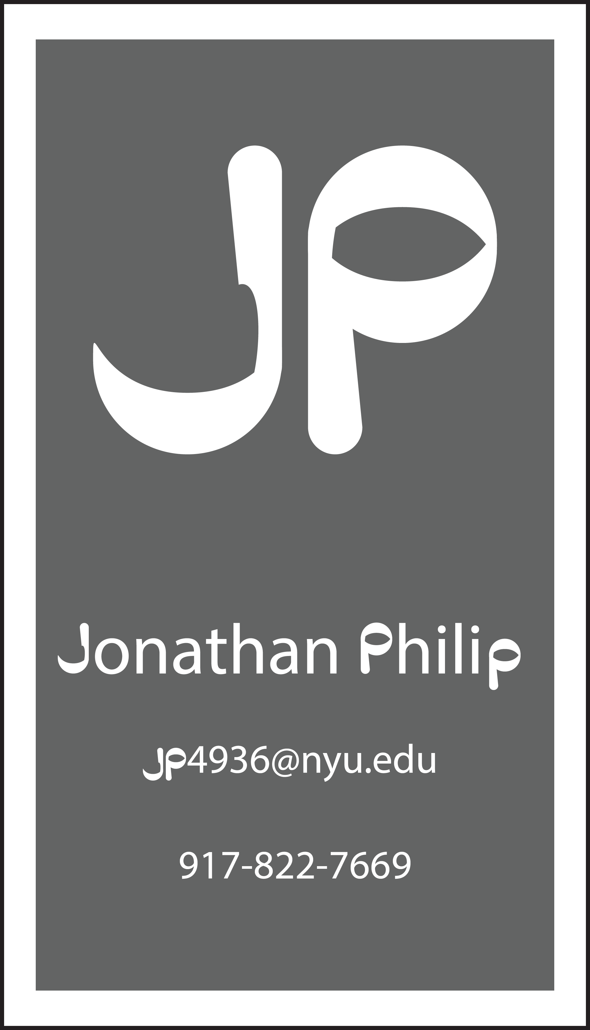
For this assignment, I started with the Myriad Pro font and typed my initials “JP”. I first turned the letters into an object and ungrouped them which allowed me to freely manipulate the anchors of the letters. After playing around with the skew and shape of the “J” I started working on the “P” in which I couldn’t create something similar enough to the ‘J” to manipulate. That’s when I realized that the “J” looked like a “P” at 180 degrees. I flipped the ‘”J” and then left it initially left it as it is below.
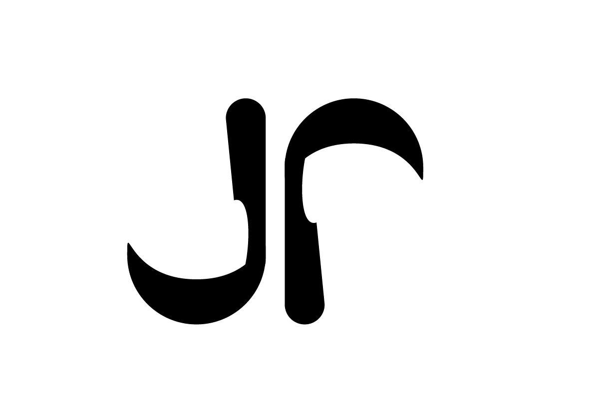
However I was concerned that the “P” could be mistaken for some other letter like an “r” or even possibly an “F”. On top of that, the “P” looked very “scythe-like” which wasn’t really aligned with a brand I wanted to represent me. To completely prevent that I decided to reflect the arch on the “P” and overlay it to create a circle and that’s how I ended up with the final design. Personally, I think the “scythe” version is a lot more appealing, but for the purpose of clarity, I prefer the final version.
#3 Response – TED talk video of Martina Flor on The Secret Language of Letter Design
Martina Flor’s presentation shows us how letters can tell us a story of what they represent by how they are designed. We are surrounded by letters that give language an image. Even if you may not understand what words letters are making, the presentation of these letters – font, size and style – can give us an idea of what they’re trying to project. Ideas like modernity, importance and even temporariness.
Her letters are her limit, but they are also her raw materials.
Martina shows us her process, how, when designing a book cover, she determines a hierarchy, and makes the words that are more important, larger than those that aren’t. She then thinks of the theme of the book (wonder), and tries to create a font that mimics it. She also thinks of the fact that the book in question, “Alice in Wonderland” is a classic, and should feel as such, and so she writes in a font/handwriting style that illustrates that feeling with more “conventional” lettering. She then decides to combine both of these themes, though opposing, both are just what this story is, and thus finds a good balance.
She then creates a system that helps her align and draw the letters more methodically. This gives her a space to focus more on the design. The shapes of the letters can mimic body language. She shows us how she can even make her favorite swear “Fuck Off” look sweeter, with an elegant, light font.
As a Spanish-speaker who has traveled to places where she did not speak the language. Her language might’ve been a limit to understanding, but with design she can still project (and understand) ideas with style, color, texture and letters. This breaks the barrier of how we think we consume language as design opens up new possibilities of communication and understanding.
Leave A Comment?