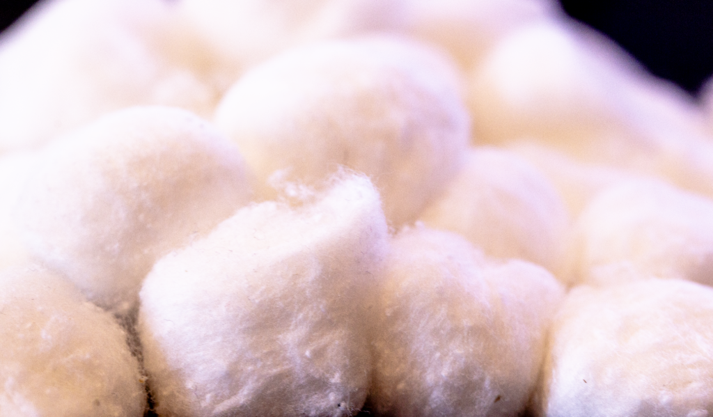
When trying to think of what my poster could be about, I immediately decided to figure out what organic material or texture I wanted to include in my composition. I thought of cotton because it could be used for clouds and was something I had readily available at home.

I took some macro shots of cotton balls on my desk to use as my texture.
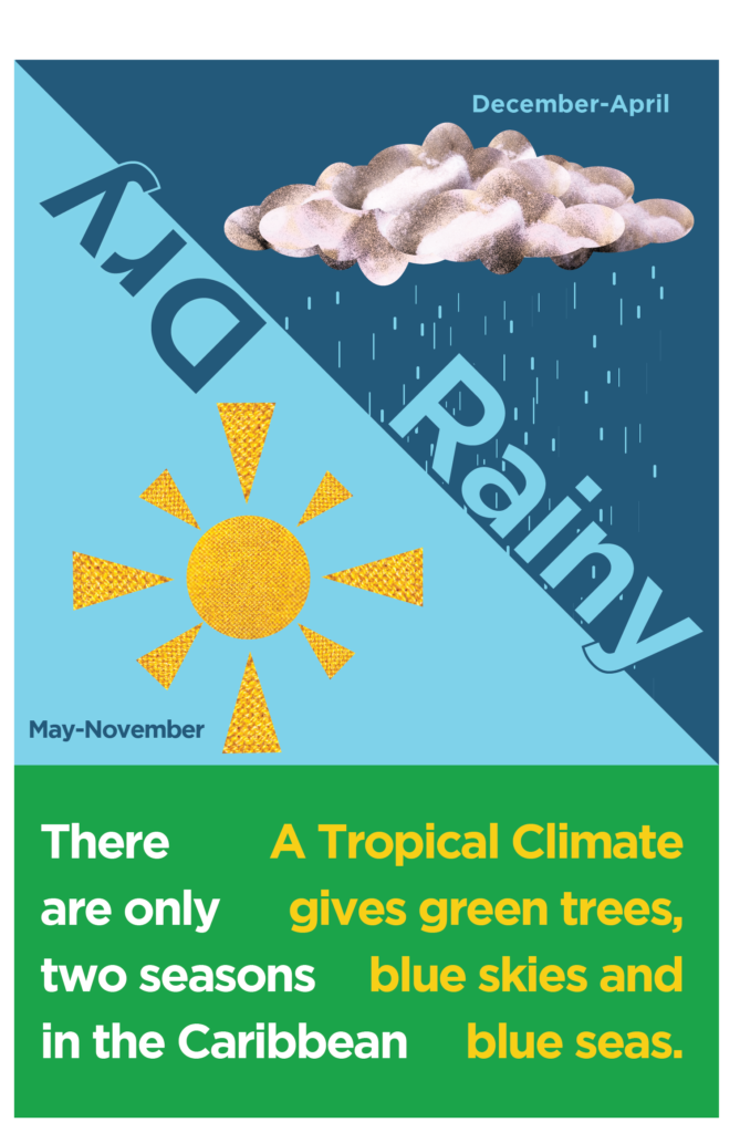
I created a cloud shape using multiple ellipse shapes and then clipmasked the shape onto the cotton image. When I had my clouds I decided that I wanted to do a poster that showed different seasons, specifically the rainy and dry seasons we have in the Caribbean.
I divided my poster in half for a dry side and rainy side but realized I didn’t know what I wanted to do with all of the lengthwise empty space below the clouds. I then decided instead to do a diagonal and divide the poster into 3 parts – a top two-thirds that I divided in half diagonally and a bottom third I reserved for text. One diagonal half I colored in a darker blue for the rainy side and the other, lighter for the dry/sunny side.
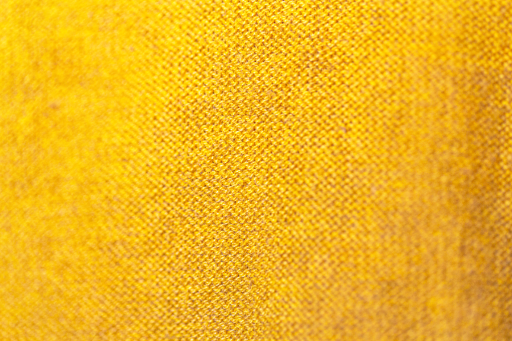
I decided to apply a watercolor effect to my clouds to make the rainy side look more grunge-like and darker and then decided against using clouds for the dry side. I created a sun with some simple shapes but then realized that if I was using texture for the clouds, I should also use texture for my sun. I took a macro shot of a mustard-colored sweater I own to use as the texture for the sun.

After I had my sun and clouds in place, I created raindrops by creating random rectangular shapes. I also added text to give my poster some meaning. I decided to color the lower third of the poster in green because I wanted to symbolize the green of the nature in the Tropical climate of the Caribbean.

Leave A Comment?